eBay CLASSIFIEDS
UI UX + VISUAL DESIGN
eBay Classifieds is a global series of online marketplaces bringing social commerce to emerging markets.
PROJECT STATEMENT
Our team was brought onto a multi-faceted design contract and asked to diversify the MVPs of a singular classifieds platform to serve countries varying significantly in cultural needs and business goals :
Gumtree Singapore | Gumtree South Africa | Vivinuncios Mexico
DESIGN PRIORITIES
Maximize the findability of listings
Incentivize participation by creating a sense of urgency
Create the feel of an abundant & bustling marketplace
Provide opportunities for monetization
Design for unique cultural nuances
Balance concerns for safety and privacy with need for info and visibility
Elevate opportunities for maximum SEO
SOLUTIONS
STREAMLINE the user experience for posting an ad for goods.
SOLVE for edge-cases and error management within user flows.
CREATE the listing and searching process for real estate and housing rentals.
DESIGN full style guides combining existing wireframes with new branding guidelines for Gumtree in Singapore & South Africa.
ELEVATE SEO through a smart redesign of navigation.
DESIGN PROCESS
SCOPE
UI UX Design Contract
Elisa Ngan + Austin Petersen Hayes + Koto + Fluid + eBay
TIMELINE | 4 Week Sprint
PLATFORM| Responsive Web - Mobile First
Shipping September 2016
METHODS
User Research Analysis
Competitive + Comparative Analysis
User & Site Flows
Affinity Diagrams
Information Architecture
Wireframing
Visual & Graphic Design
Animation
Interaction Design
Design for SEO
ANALYSIS
We conducted a thorough competitive & comparative analysis of the information architecture and feature sets of classified platforms in addition to internationally known and culturally relevant real estate listing sites.
Using our findings, we developed an extensive feature list and created a prioritization matrix that ranked the importance of features in regards to competition and our users culturally specific needs and pain points.
SEE ALL ANALYSIS >
STREAMLINING FLOWS
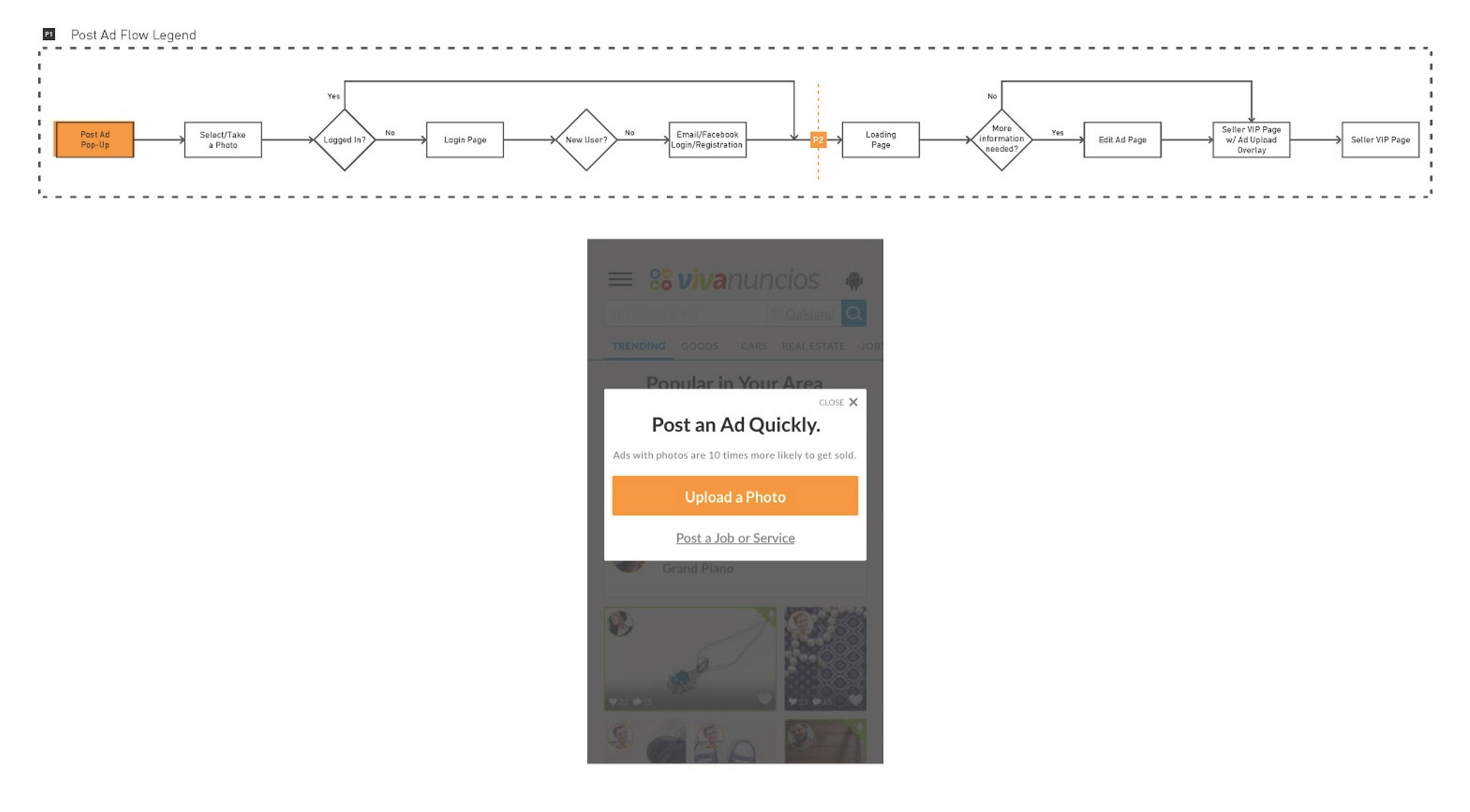
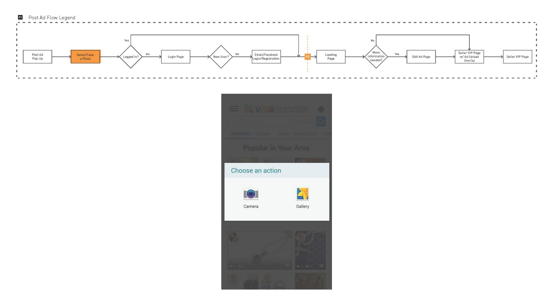
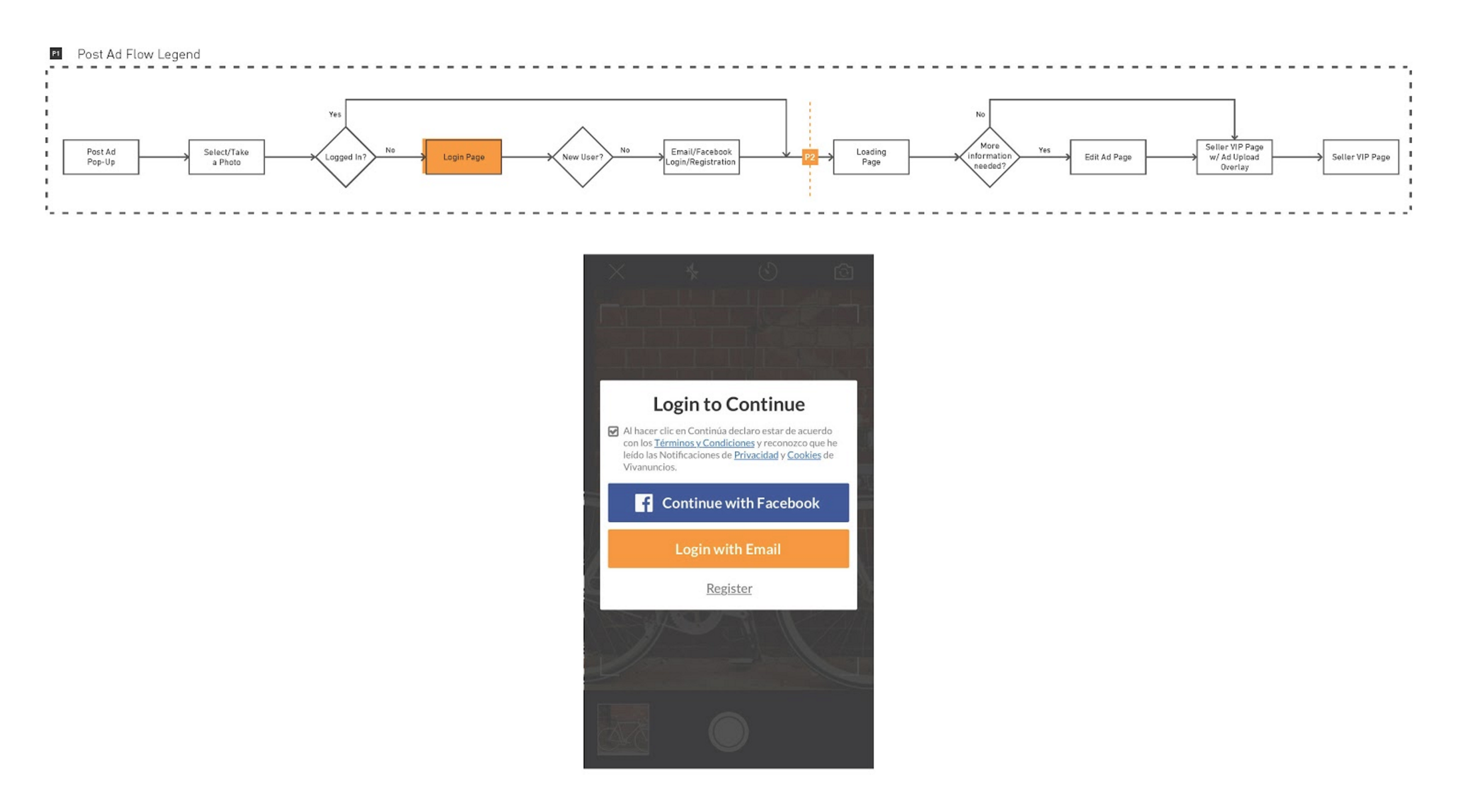
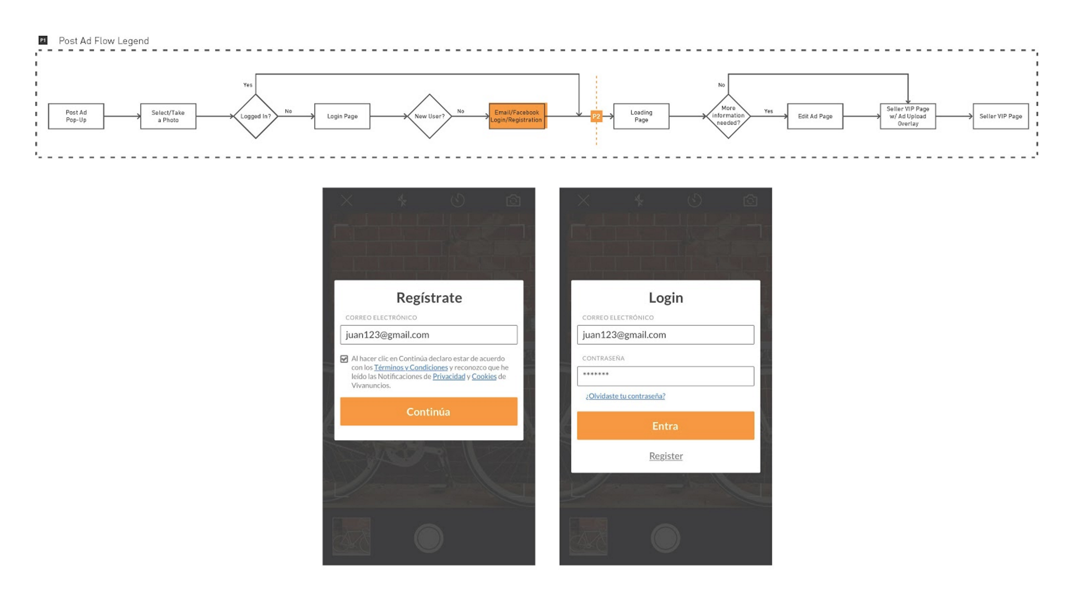
Our goal was for the experience of posting an ad to be as frictionless and streamlined as possible.
Proper categorization is integral in both the findability and abundance of the platform. Listings must be searchable and discoverable to buyers, both of which are determined by proper categorization.
If properly categorized, items will appear where they belong, giving the platform the abundant feel that it needs to encourage users to participate in a thriving marketplace.
However, a large portion of the drop off rate with current users occurs when they are asked to categorize their listing. The new design had cut that out of the flow altogether.
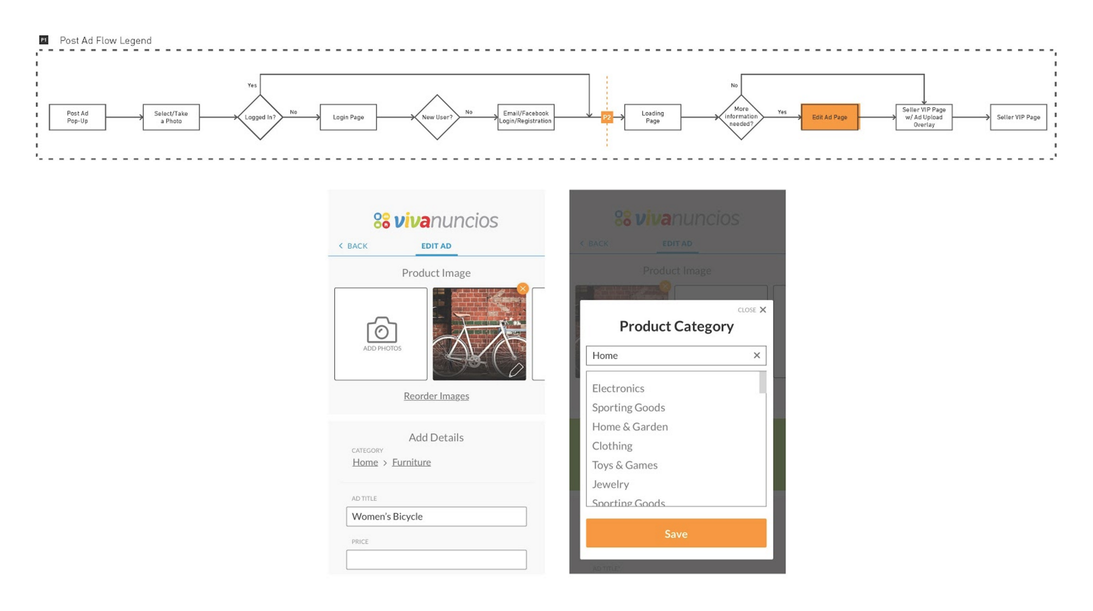
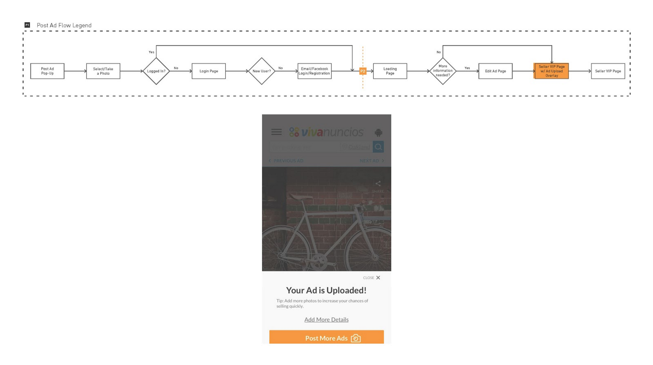
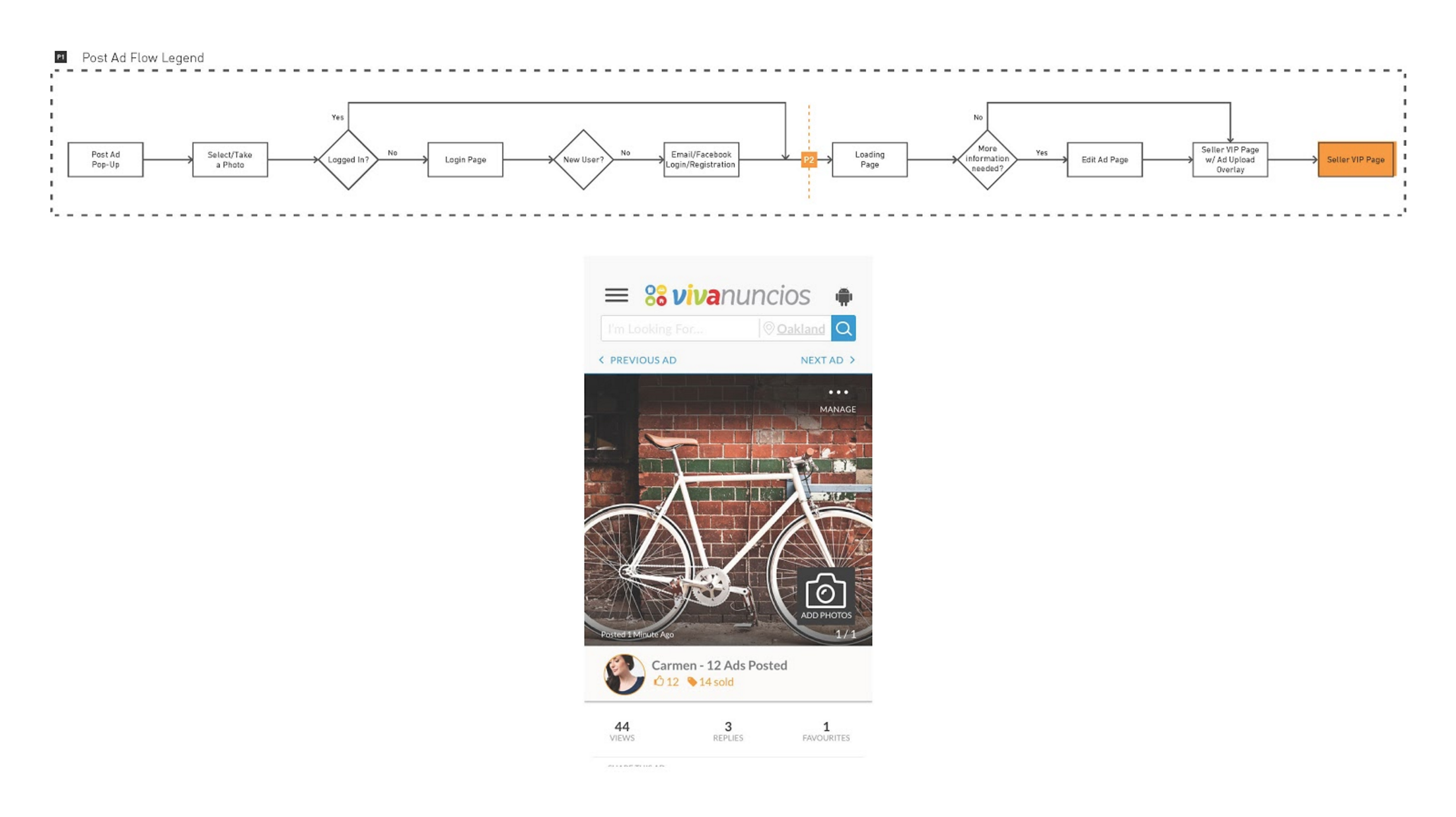
The MVP design we were presented with - as shown below - solves for this by employing image recognition software to auto-complete listing categorization and allows the seller to change the categories by tapping the breadcrumbs.
The problem we saw with this was if an item is categorized incorrectly, the user could not easily identify the error or intuitively find a way to change the categorization.
MVP USER FLOW
We proposed a simpler and more visual approach which would keep the information architecture of the category system intact while visualizing it in a more accessible and rewarding way for the users.
REAL ESTATE FEATURE
Using our feature prioritization matrix + user research conducted by eBay + Fluid we designed the following pages for viewing real estate listings.
USER CENTERED PRIORITIES |
User preference for large images in addition to access to multiple images.
Prominent, positive rating system to build trust and safety.
Limited location information to build privacy.
Specific neighborhood information to reduce unknowns.
Tracked & visualized interest & activity to drive urgency.
Encourages seller contact in multiple forms and locations.
ELEVATE SEO
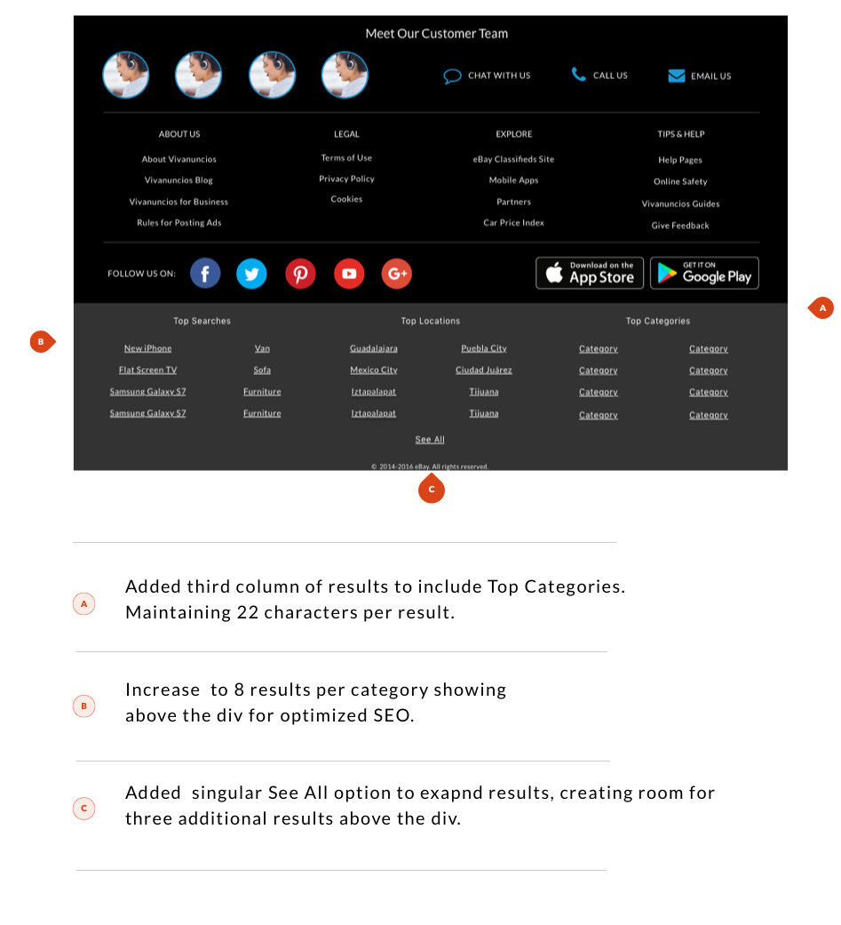
In order to elevate the SEO we had to redesign the navigation to show as many results above the div as possible while maintaining mobile usability.
Our solution increased suggested search terms for our users by over 70% without making significant changes to the visual design.
VISUAL DESIGN
All of the new eBay classifieds platforms have been developed with a single back-end that is the same structure for all platforms, however each site has its own branding and visual design to satisfy cultural tastes and trends.
I was given platform guidelines in addition to access to user research and was asked to apply these elements to create full new style guides for Gumtree South Africa and Gumtree Singapore. My visual design was required to follow the branding guidelines provided by KOTO and the wireframing guidelines by FLUID, while designing for users within two different emerging markets.
SEE THE SOUTH AFRICAN STYLE GUIDE >
ONWARD
The beauty of this marketplace tool is that it provides access to items available from both individuals and professionals, giving users a comprehensive shopping experience within their communities.
The future of this classifieds platform lies in the realm of intuitive searching & browsing experiences and streamlined interconnectivity between buyers and sellers through enhanced messaging features.


